A pie chart is named for its resemblance to a sliced pie and is a circular visual representation illustrating numerical proportions through slices made in a circle. Here the arc length of each slice is proportional to the quantity it represents(and consequently its central angle and area). There are many variations in the way pie charts can be presented however they have been extensively used in business presentations, considered ideal for giving the reader a quick idea of the proportional distribution of the data.
Quick details
What: Discover Proportion, Rank
Why: Display relative proportions of multiple classes of data in the simplest way
History of Pie Chart
Pie charts have been used across history however are first credited to be used by William Playfair’s in 1801 to represent Statistical Breviary of 1801 and the proportions of the Turkish Empire located in Asia, Europe, and Africa before 1789. In 1858 a French engineer named Charles Joseph Minard used pie charts to represent the cattle sent from all around France for consumption in Paris. While it was Florence Nightingale who popularized the pie charts with her diagram of the causes of mortality. Throughout pie charts were thought to be in need of a third dimension to add additional information.

When to Use a Pie Chart?
1When you need to compare categories in a smaller data set
Use Pie charts when you need to compare categories however with the presence of small sets of data. Being visually simpler than other types of graphs, and not multiple-series in nature they can give the reader a quick glance of the proportional distribution of the data. Comparing a given category (one slice) within the total of a single Pie Chart can be done effectively with these charts.
2Understand part to whole relationships effectively
Use pie charts if your goal is to compare a given category (a slice of the pie) with the total (the whole pie) in a single chart and the multiple is close to 25 or 50 percent. In such a scenario a pie chart can often be more effective than a bar graph, working best with a few constituents. If the largest slices are placed from the top (like on a clock) and followed up with other slices, collectively, the data should add up to 100%.
3When you need to explain and compare additional parameters through a circular representation
Use the different variants of pie charts like the Doughnut charts and the polar chart to represent additional information which cannot be represented in a standard Pie Chart. A polar chart, for instance, is a type of circular graph that can support multiple statistics at once and it provides a better data intensity ratio to standard pie charts. With doughnut charts, additional information can be represented in the center.
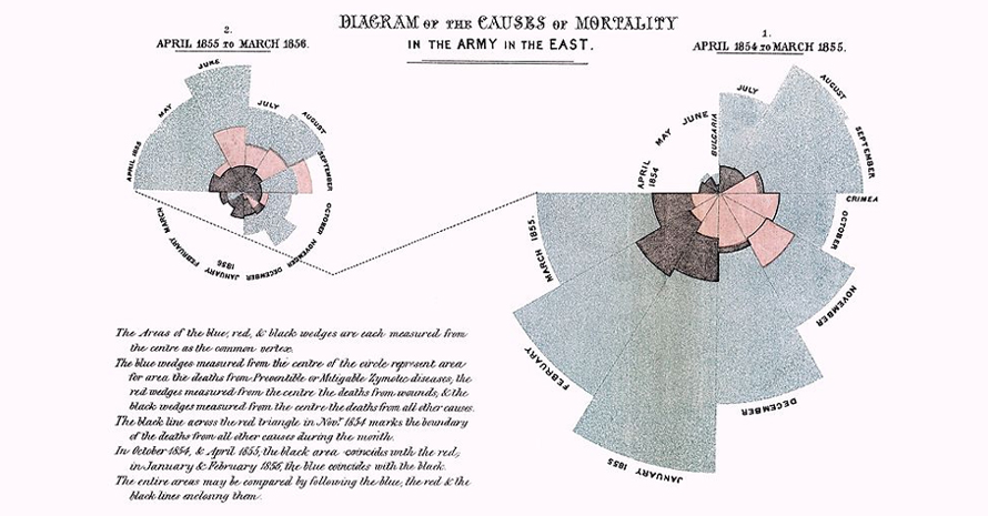
Polar chart by Florence Nightingale, 1858, If the death count in each month is subdivided by cause of death, it is possible to make multiple comparisons on one diagram
Types of Pie Charts
1. 3D pie chart /Perspective pie chart
This chart gives a 3D look and is often used for aesthetic reasons. However, the third dimension does not improve the reading of the data and is discouraged due to adding difficulty for interpretation.
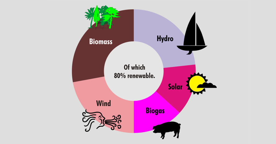
2. Doughnut chart
This chart has a blank center allowing for additional information about the data as a whole to be included.
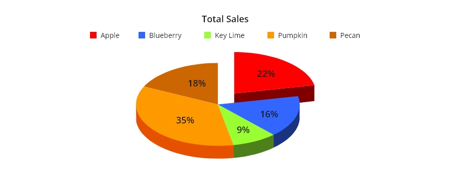
3. Exploded pie chart
Here one or more sectors separated from the rest of the disk. This effect is used to either highlight a sector or to highlight smaller segments of the chart with small proportions.
4. Polar area diagram
Here sectors have equal angles and differ rather in how far each sector extends from the center of the circle. The polar area diagram is used to plot cyclic phenomena (e.g., counts of births by month).
5. Ring chart, sunburst chart, and multilevel pie chart
This is used to visualize hierarchical data, depicted by concentric circles. A segment of the inner circle bears a hierarchical relationship to those segments of the outer circle which lie within the angular sweep of the parent segment.
6. Spie chart
This is a variant of the polar area chart which superimposes a normal pie chart with a modified polar area chart to permit the comparison of two sets of related data.
7. Square chart / Waffle chart
use squares instead of circles to represent percentages. Similar to basic circular pie charts, square pie charts take each percentage out of a total of 100%.
When Not to Use a Pie Charts?
1When there are many proportions to represent
Pie Charts become crowded and hard to read if there are too many pieces of data, even with data labels and numbers. This makes it difficult for readers to analyze and assimilate information quickly and make decisions.
2When an accurate and an at a glance comparison is required
Do not use pie charts for efficient and quick visual comparison as you have to factor in angles and compare non-adjacent slices, creating complexity in comparing the data slices. To make decisions based on visual impact rather than data analysis leads readers to draw inaccurate conclusions. To allow quick comparison and measurement, bar graphs can represent data by length and are a better visualization.